Sunday, June 04, 2006


Don't panic! Don't panic! Unless you're a creative who's run out of steam...
Leesten vay carefully, I shall say zees only wurnce: your World War II gags are becoming tired.
They do mention the war. And I don't think they get away with it.

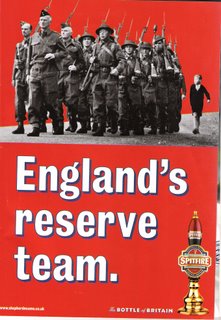
The latest campaign from brewer Shepherd Neame for Spitfire Beer continues the well-worked Second World War theme. There is, however, now a topical twist. A relatively low-key sporting competition - which I believe the Americans describe as "The Soccer World Cup" - is about to get under way in Germany. To the creative teams on the Spitfire account, this is the equivalent of der Geburtstag and das Weinachten arriving at the same time.

At a purely technical level, the ads are of varying quality. They range from the subtle and moderately amusing ("Best of luck chaps - see you in Berlin) to the downright laboured ("England's reserve team", with a picture of Home Guard members on parade). I think, however, we've got past the point at which individual executions can redeem the overall campaign. There's a tiresome familiarity to it all now and a definite feeling that the creative factory is churning stuff out faster than a wartime parachute factory.

Is it all a bit of harmless fun? Up until now, the answer was probably yes. But context is everything. The British Advertising Standards Authority frequently rules, for instance, that a provocative or explicit ad is ok in certain media - such as men's magazines, for example - but cannot be used as a poster in Piccadilly Circus, for fear of upsetting passing infants, grannies and others of a nervous disposition. Here, we have ads that might be alright at another time, but look decidedly dodgy at a point when thousands of England fans are going to be descending on Munich and Berlin. Not all of these boys are known for their sophistication and sense of post-modern irony. And while I doubt that the Spitfire ads are going to provoke a re-run of D-Day on the terraces at Gelsenkirchen, they are not exactly the kind of thing designed to ensure cordial relations either.

I could write lots of pompous waffle about advertising creatives having a sense of social responsibility, but I'm not sure that it would cut too much ice with those who conceived the ads. So I'll just make this point to them: if you're going to stir things up in advance of the World Cup with references to World War II, you better make sure that your stuff is genuinely funny. And that you're not melting old saucepans to create your latest Spitfire gag.

© Phil Woodford, 2006. All rights reserved.

Phil Woodford is a freelance writer and trainer. He works as an associate lecturer at the University of the Arts London. www.philwoodford.com

Sunday, January 29, 2006

More power to you: 4-wd dm letta from BT is lol

The first sentence in a sales letter is important. Especially when it’s the only one.

I’m launching a brand new course tomorrow at the London College of Communication that focuses on the mysterious world of direct mail. I cut my copywriting teeth creating direct-response ads and sales letters, so it’s a subject close to my heart. As a result, I’m always looking out for innovative new creative approaches and techniques. “Junk” mail is unlikely to go in the bin at home. The chances are that it will head to the filing cabinet or scanner.

I’m indebted to my former colleague Alice (who blogs amusingly here about her preparations for the London marathon) for a convention-defying letter that will be great fun to show in the class. It was sent out by BT in December to promote their text service that allows UK customers to send and receive SMS messages on their home phone.

What exactly made this letter different and worthy of comment? Well, direct marketing science tells us that long letters generally perform better than short ones. That’s why you see letters running to two, three and four pages in many commercial and charitable mailpacks. You need time to explain the central benefits of your product, outline your offer and overcome any potential objections. You’re not there in the room with the customer to answer questions, so everything they need to know should be written down in black and white.

But BT apparently didn’t agree. They decided that two pages would be too much. In fact, they decided that two sentences would be more than they needed. Their extraordinary letter had only one line after the salutation, which sat in acres of white space. It said simply R U OK? Some more white space followed and led to the sign-off from Jillian Lewis, the company’s Customer Services Director.

Now, admittedly they cheated just a little. There are a couple of short paragraphs in the place where textbooks would normally tell you to put a PS. The copy starts: “There are times when you just want to send a short message home rather than have a long drawn-out conversation. With BT Text you can now send and receive texts on your home phone.” The net result is that the sales letter reads more like a traditional press ad, with the truncated body copy acting as a headline. It’s very brave. And it works a treat.

I do, however, intend to teach my students some of the more traditional conventions of letter writing. After all, it’s good to know the rules before you choose to break them into very tiny pieces.

© Phil Woodford, 2006. All rights reserved.

Phil Woodford is a freelance writer and trainer. He works as an associate lecturer at the University of the Arts London. www.philwoodford.com


Why Bodyform's advertising strategy isn't working.

I obviously wasn’t the only person to notice this poster opposite Kingston train station in the suburbs of London. It’s a bizarre execution for Bodyform, which parodies a Conservative Party election poster from 1979.

Think about it for a moment. The 2006 ad is pretty lame if you don’t have a fix on the original reference. (To be honest, it’s pretty lame even if you do, but we won’t go there for the moment.) The Tory ad commented – somewhat ironically, given later events – on the supposedly high levels of unemployment under Jim Callaghan’s administration. So the only people likely to remember it will be in their late 30s at the very least. Probably more likely to be in their early 40s. Visit the Bodyform website and you’ll discover that – logically enough – the primary target audience is actually young women.

I daren’t ask the age of the creatives at BBH who came up with the campaign, because I’ll probably be told it was a couple of 21-year-old female placement students. They just happen to have a passion for British political history. And a habit of missing the target.

© Phil Woodford, 2006. All rights reserved.

Phil Woodford is a freelance copywriter and trainer. He lectures in advertising at the University of Westminster in London. www.philwoodford.com

Monday, January 16, 2006

The hired gun can't fire blanks

Once in a while, I’m going to use these pages for a little reflection on the whole process of creativity. Perhaps it’s a little self-indulgent, but the more that I teach copywriting and creative writing, the more I find myself pondering some of the fundamentals. My recent move into self-employment has focused my mind even more.

Although I’ve undertaken a range of freelance writing and training assignments in the past few years, there’s always been a day job – most recently as joint creative director of a London agency in the niche field of recruitment marketing and employee communication. Working in the agency environment four days a week, I got very used to the personalities and processes. Although the pressure of work can sometimes feel relentless in the advertising business, I was very fortunate to have a great many good colleagues that I knew and trusted. It felt comfortable. They knew how I was likely to behave and I had a pretty good idea of what they were thinking too. Sometimes, when you were brainstorming creative concepts, the old truism of being able to complete one another’s sentences really did apply. And there are undoubtedly big advantages to these kinds of relationships. People aren’t afraid to express their ideas, for instance. It’s also easier to pick up other people’s work when a job goes round the houses.

But advertising creativity is an oddity. It’s one of the few areas of working life where two people – usually an art director and a copywriter – are asked to work as a pair. Often it’s done on an ad hoc, mix-and-match basis. Sometimes, particularly in the larger consumer agencies, the relationship is permanent. It’s difficult to think of many parallels, apart from maybe American cops like Cagney & Lacey or Starsky & Hutch. These paired relationships can have their downside as well. You can get to know the people you work with too well. Sometimes this means that you don’t challenge yourself or your partner quite enough.

It can often be good to encounter somebody new who works in a completely different way. They can pose unusual questions and uncover unlikely angles. It’s a phenomenon I encountered at the start of the year when I walked into an agency as a hired gun. I’d never been there before and was teamed up an art director I’d only met previously on an awards judging panel. This guy is very good. But I’ve worked with a number of good people over the years. The thing that really forced me to raise my game was the fact that we’d never worked together before. He was seeing what I could do. In the nicest possible way, testing me out a little. Inevitably, I was doing the same. And the net result, I think, was some really nice conceptual advertising. As a freelancer, I can’t afford to fail, so my grey matter is getting an extra special workout right now.

My advice, for what it’s worth, to any aspiring copywriter or art director is to work with as many different people as you can. A little cosiness can help you magic up some really good creative work. But a little edginess is perhaps more likely to produce something great.

© Phil Woodford, 2006. All rights reserved.

Phil Woodford is a freelance writer and trainer. He lectures in advertising at the University of Westminster in London.


Saturday, December 10, 2005


Breaking the language barrier: Alex Woodruff and Vanessa Cisz in englishtalk's Stuttgart offices.

Interesting discussions in the land of wild boar

What separates true entrepreneurs from the wannabes? I suspect it’s an uncanny ability to spot an opportunity or niche in the market and act quickly to fill it. That’s exactly what marketing consultant Alex Woodruff did when he founded englishtalk (
www.englishtalk.net) – a business that assists German advertising agencies and corporations to promote products and services more effectively in the UK, US and other English-speaking countries around the world.

I travelled to Southern Germany recently to meet Alex and his colleague Vanessa Cisz, who oversee the englishtalk operation. Their offices can be found in an attractive suburb of Stuttgart, where German football coach Jürgen Klinsmann’s family runs a traditional konditorei (
http://www.klinsmann.us/bakery.htm) and wild boar roam freely in the local woods. Once Alex and Vanessa are checking their e-mail, however, the romance of the countryside soon gives way to hard work. Englishtalk is linked with a number of leading businesses in the regions of Baden-Württemberg and Bavaria, but actually has clients as far north as Hamburg.

Often deadlines are tight and it’s not unknown to work into the night when an ad agency is preparing a pitch for new business. Certainly the service on offer – colloquial adaptation of translations, or the creation of bespoke marketing materials by native English speakers – is essential for marketers and advertisers. From a creative perspective, there are huge dangers in relying on a straightforward translation from one language to another. Even good linguists may miss subtle nuances. And it’s often at this subliminal level that advertising and marketing material actually works. Alex and Vanessa, who hail from England and America respectively, ensure that a vibrant and persuasive piece of copy in one language doesn’t become incomprehensible or tedious in another. More importantly, perhaps, they look out for those giveaways that sound warning sirens for the reader. Odd turns of phrase or poorly interpreted idiom.

And these things can be very subtle indeed. On a short connecting flight between Zürich and Stuttgart, Swiss International Airlines handed me some chocolate with the following message: “Two reasons to be happy: We are Lufthansa’s partner airline and we still serve Swiss chocolate.” It’s difficult to criticise the way in which these heart-warming thoughts have been translated into English. At a purely technical level, there’s nothing much wrong. It’s just that an English copywriter like me would have written the lines differently. The airline’s “reasons to be happy” sound a little too much like an instruction or order to the British ear. And the two joy-inducing facts are, of course, completely unrelated. Which means they’re better written as two sentences rather than one. Tiny, pedantic changes, but ones that can shift perceptions.

I’m sure the englishtalk business is likely to grow as more German businesses grasp the importance of native-speaker involvement in marketing. The result will undoubtedly be sales growth. And perhaps even tastier copy for Swiss chocolate.

Phil Woodford is a freelance copywriter, trainer and lecturer.
www.philwoodford.com © Phil Woodford, 2005. All rights reserved.

Sunday, November 06, 2005

Where's the proposition? How cars, fries and bras have been defying convention

I was preparing a lecture recently on the theme of propaganda and advertising for the University of Westminster in London and it got me thinking about the way in which major corporations have become wary of traditional approaches to ad campaigns. I’ve blogged before about Volvo’s “Mystery of Dalaro” mockumentary and the “Life on Board” project, which take a surprisingly subtle approach to selling cars. It’s almost as if the in-your-face hard sell is thought to be counter productive nowadays. Perhaps the public is just too street wise? If we know we’re being sold to, we turn off. It’s therefore better to dress your commercial message in some unusual clothes. You can catch folk unawares before they dismiss your creative approach as commercial propaganda.

Audi’s “Art of the Heist” is perhaps the most elaborate exercise in this new ‘project’ genre and what they did to promote the A3 in the States is almost too complex to cover here. You can get a flavour at
www.theartoftheheist.com and www.stolena3.com In a nutshell, agency McKinney-Silver created a three-month storyline involving a vehicle that had supposedly been stolen and then embellished it with movie content, multiple websites and real-time gaming that involved the general public. It all ended in an event at a Santa Monica hotel that was broadcast live over the web. Certainly a long way from the TV commercials we all grew up with. Whatever happened to the motor chasing its way through narrow mountain passes or skidding to a halt in the middle of the Arizona desert?

It’s not only car manufacturers that have got in on the act, however. Early in 2005, Americans were treated to the McDonalds French fry that looked like Abraham Lincoln. Blog pages and auctions on Yahoo! were just as critical to the success of the campaign as the TV commercials (see
http://lincolnfry.yahoo.com/), although it has to be said that the television spots are beautifully written and directed.

At first glance, these campaigns seem to break some of the basic, age-old rules of advertising. Why isn’t the product centre stage? Where is the core, compelling proposition? On the first point, I’d argue that Audi A3s and the McDonalds fries are still core products, even if they’re ‘stolen’ in a make-believe game or shaped to look like former US Presidents. There’s no denying, however, that the classic sales pitch is hard to identify. The directness much beloved of old-school advertising executives has been replaced by something that’s altogether more touchy-feely. One can only assume that it’s thought to work though, as the budgets involved in some of these exercises would make failure difficult to contemplate.

When it comes to weird and wonderful approaches, there is of course a sliding scale. Some brands don’t go the whole hog, but still find an unusual and offbeat angle. A good example would be the recent UK campaign for Wonderbra, which doesn’t feature the product directly but concentrates instead on the public’s reaction to it. Experience WonderYou by clicking
here. It may not be as elaborate as some of the other campaigns, but it does still defy convention to a certain degree.

American adman Rosser Reeves is credited with inventing the concept of the USP, which has served marketing professionals well over many decades. If he were working today, I’m not entirely sure what he’d make of cars that disappear and bras that hide themselves away. But to paraphrase one of his own famous remarks, if it makes the goddam sales curve go up rather down, it can’t be all bad.

© Phil Woodford, 2005. All rights reserved.

Phil Woodford is an advertising creative director and lecturer.
W
www.philwoodford.com E 108th@philwoodford.com

Sunday, September 04, 2005

Phil Woodford


Phil Woodford
Originally uploaded by sdwpw.

Ideas for this site? E-mail me at 108th@philwoodford.com

Thursday, September 01, 2005

Trained by Jerry. Banned by train bosses.

Advertising creatives usually love to shock. And there’s no better way to prove you’ve shocked people than to have one of your ads banned. That’s why I was a little surprised that one of the younger members of our agency creative team seemed to endorse the censorship of a provocative poster from TV music channel VH1. The ad in question is promoting a show that airs in the UK for the first time on 4th September – Jerry Hall’s Kept (http://www.vh1.co.uk/vh1.co.uk/shows/kept.jhtml) To summarise this televisual trash in a nutshell, the glamorous Texan model and actress spends a few weeks vetting a bunch of hunky toyboys. They are eliminated one by one in classic reality TV style, until only one remains. This lucky fella gets to live Jerry’s millionaire lifestyle for a year and is handed the keys to a Jaguar, along with an American Express Gold Card. I’m still waiting to hear about my application for the show, which must have got lost somewhere in the mail.

In the controversial poster, which was plastered up around London by Viacom but taken down by bosses of London Underground, Jerry is seen at the bottom of a spiral staircase, presiding over a number of scantily-clad, leashed men who are down on all fours. The copy says simply: Twelve get trained. Only one gets kept. Jerry Hall’s Kept. Starts this Sunday at 6pm.

At a pure advertising level, this ad does exactly what it should. It catches your attention. It tells you everything you need to know about the product. If you’re advertising a TV show, you give the name of the programme and say when it’s on as quickly as you can. But you add just a touch of panache and style. Great examples include the headline “Parole Denied” alongside a picture of the cast of Bad Girls announcing a new season on ITV1. Or a picture of Kiefer Sutherland as Federal Agent Jack Bauer in 24 with the line “If you don’t have Sky One, you don’t get Jack.”

So where has VH1 gone wrong? Our young copywriter agreed with the tube chiefs that the poster was treating the pictured men as sexual objects. Presumably, this is felt to be demeaning. Her argument was that if the sex roles were reversed and it were women crawling around the floor, the poster would obviously be unacceptable. I wholeheartedly agree. But the poster doesn’t feature women. It features men. Men, I believe, who should be big and testosterone-filled enough to take this tongue-in-cheek poster execution in their stride. Even when they’re on all fours.

We live in a world where women often feel threatened by physical and sexual violence, earn less than men and struggle to make it into the top echelons of business and politics. In this context, there is a big difference between presenting men as subservient slaves and presenting women in the same light. The first is a joke. The second, for far too many women, is a rather too close to reality. Maybe I should never have studied sociology at university, but I find myself in the weird position of championing the feminist cause to a younger female colleague. Perhaps it’s one stage better than the position I’d be in if I were one of Jerry’s kept men.

© Phil Woodford, 2005. All rights reserved.

Phil Woodford is an advertising creative director and lecturer. www.philwoodford.com

Sunday, June 05, 2005

Go MK? I'd rather go to L.

Can cities become brands? It’s a question a colleague placed in my mind recently when she told me about the efforts of Milton Keynes to promote itself as a “thriving, cosmopolitan city”.

For those of you who’ve never had the pleasure, Milton Keynes is a British ‘new town’ created after the aerial bombardment of World War II. Uncharacteristically for the UK, its anonymous streets run in a grid pattern reminiscent of cities in the USA and the place is about as pedestrian-unfriendly as you can imagine. If you conducted a public poll on perceptions of the place, I guess that people would think of it as pretty boring and sterile. Which must be the thinking behind its recent reincarnation as “MK”. While Milton Keynes sounds 1940s and rather austere, MK is go-getting and oh-so-twenty-first-century. A logo and a website have been produced (see http://www.gomk.net/), along with an excruciating exhortation to local residents to champion the city’s further progress. The slogan “Go MK” is so trite and embarrassing that it’s only possible to imagine endorsement from earnest local government officials and primary school children. Or perhaps it’s a description of what happens to residents if they spend too long in the place? “He’d only been here five years and went completely MK.”

No doubt, some important folk feel that the abandonment of Milton Keynes is some highly original piece of rebranding, but I have to say I’m not entirely convinced. Has the local population really bought into the whole MK phenomenon? Because if it hasn’t, it’s very difficult for a few advertisements and web pages to make much of an impact in the outside world. It’s just the same when businesses rebrand. Unless the employees of the company understand and endorse the changes taking place, it’s difficult for customer perceptions to shift.

And as for originality, Milton Keynes isn’t the only town on the rebranding trail. Nottingham, according to news reports in early 2005, has junked Robin Hood as its symbol in favour of the letter ‘N’. A slanted ‘N’, to be precise, that cost £120,000. And this is where I think the marketers really are losing the plot. The brand ‘equity’ – to use a hideous piece of marketing jargon – of Robin Hood is rather stronger and longer-lasting than anything that’s likely to replace it. In fact, it’s been tried and tested for several hundred years. The notorious outlaw is not only well known in the UK, but he’s been robbing rich Americans of their tourist dollars for a while too. If the old boy’s bow and arrow ain’t broke, why fix it? The next step, of course, would be to change the name of the place entirely. Constantinople did, after all, become Istanbul. But I think that was after the fall of the Byzantine empire. The relegation of the local football club, Nottingham Forest, to what was once League Division Three isn’t quite on the same scale perhaps.

If cities need brand identities – and I suppose in this crazy, mixed-up, competitive world, they probably do – I think a lesson can be learned from the American states. Whilst some, such as Kansas, favour obscure Latin mottos (Ad astra per aspera), others like Indiana (The Crossroads of America) have gone for the compelling and self-explanatory. In common with any good advertising tagline, it does exactly what it says on the tin.


I'm off to work on a new campaign to promote London. It's called Go to L.

© Phil Woodford, 2005. All rights reserved.

Phil Woodford is an advertising creative director and lecturer. www.philwoodford.com


Friday, February 04, 2005

Channel 4’s Nathan Barley Campaign: it’s well weapon

If you’re a regular user of the London Underground, you will probably have seen the recent poster campaign for an unlikely mobile device called the Wasp T12. I was particularly intrigued by the headline. Apparently, the phone or gaming machine or whatever the hell is featured in the ad is ‘well weapon’.

The heart of this 36-year-old copywriter sank immediately. What future is there for an ad man unfamiliar with such scary street vernacular? I just had to visit http://www.trashbat.co.ck/ to find out more. (And, yes, you did read it correctly. That’s .co.ck.) On the site, there’s a chance to explore an alarming amount of technical detail on the T12. But dig a little deeper and you’ll find evidence of a highly sophisticated marketing campaign for the new Chris Morris sitcom, Nathan Barley, due to air on 11th February. The show centres around a young guy working in new media and the trailers are viewable online. It’s the kind of thing that will only truly make sense when we’ve seen the first episode. But I know that Channel 4 has already attracted at least one viewer.

Although completely different in content and tone, the spirit of the Barley campaign is very similar to the work being done for Volvo with the Mystery of Dalaro and the Life on Board Project. It’s difficult to find new and original ways of promoting TV shows and cars, but intriguing, slow-build multimedia campaigns often have a strong viral effect. I’ve told a number of people about Barley already, for instance. The website becomes the hub of the campaign, because it’s so easy to pass around links via e-mail.

Chris Morris is a highly controversial figure and I’ve no doubt that this sitcom will cause a bit of media stir. In the meantime, I’ve ordered my Wasp and plan to stream the programme direct to my handset.

Copyright Phil Woodford, 2005. All rights reserved.

Phil Woodford is an advertising creative director and lecturer.

Friday, October 29, 2004

Suits you, Sir: the wonderful world of Mr Raja Daswani

Hong Kong tailor, Raja Daswani, always makes for an interesting discussion point at my copywriting seminars. I treasure an advertisement I found a year or two ago, in which he announces a visit to the UK and reassures lady readers that the men in their lives can be transformed through the purchase of bespoke suit. The language is curiously olde worlde and colourful, with phrases such as "fear not" and "significant other" making an appearance. At one level, I produce the ad as an ice-breaker, to demonstrate how quirky and idiosyncratic copy can actually be. The initial reaction of most students is to assume that Daswani is simply an eccentric and rather immodest businessman from Kowloon, whose grasp of English idiom comes from a formal schooling in a bygone era. Perhaps that's true. But over time, I admit that I am beginning to doubt this rather simplistic explanation. Could it be that Daswani is simply very clever in his application of advertising creativity? Is it possible that he - or those who advise him - realise that the more exotic and foreign he sounds, the greater the chance that customers will take an interest? It's his very eccentricity that provides his unique selling proposition.

A recent advertisement in The Sunday Times seems to confirm my theory. "Would you rather pay the same sum for a single, off-the-peg, chain store suit cut by a computer or sold to you by a spotty boy who thinks side vents are to be found on a Lambretta scooter, or for two bespoke, custom cut, hand-stitched suits, measured and sold to you by a man for whom suits are a lifetime passion?" That's a sentence and a half. It produces serious green wavy lines in the Microsoft Word grammar checker, as I prepare this blog entry. Not the kind of English easily constructed by a man who was schooled in strict rules of grammar forty years ago. More the kind produced by someone who's trying deliberately setting out to create a piece of copy that is exotic, amusing and memorable.

By the time you head towards the end of the ad, you get a sense of a man who is having some fun with the newspaper's readers. Daswani promises customers "the full Kowloon monty" and finishes with a real flourish. "It now remains to see whether the Raja revolution, with its inspired mix of artistic flair, entrepreneurial genius and digital technology, will see the end of the off-the-peg British chain store suit. On price alone, it's a sartorial solution that will even please the Suits in accounts." The suits in accounts? Suddenly, we have a level of colloquialism and wordplay that even many native British writers would find hard to match.

A quick web search reveals that Daswani is not only the chosen tailor of a number of British celebrities, but also running a highly profitable business. This kind of success almost certainly comes from nous, rather than naiveté.

© Phil Woodford, 2004. All rights reserved.

Phil Woodford is an advertising creative director and lecturer.

Sunday, September 12, 2004

Advertising creativity and the things that happen in supermarket aisles

"What if...?"

It's the question that all good advertising creatives have to be able to answer. When confronted with a selling proposition for a product or service, they ask themselves what would happen if they took the idea to extremes. It's in this zone that agency copywriters and art directors are at their most deadly and most innovative. It's here that they really earn their inflated salaries.

A good example would be the notion that the Danes love Carlsberg. On its own, the proposition is nothing special. But when you take it to its logical conclusion, the idea suddenly finds a new lease of life. If the Danes love Carlsberg so much, how might their adoration manifest itself? Perhaps they would marry the lager or send it love letters? Maybe they'd treat the brew with special care and attention? Alternatively, they might react angrily to the idea of anyone taking it out of their country. This latter twist was translated into some great television advertising. Once you've taken the idea to its limits, the scripts start writing themselves.

The latest Lynx campaign by BBH is also a great example of a proposition being worked through to its logical conclusion. A young couple wake up after a night of passion and retrace their steps. They find their underwear in the apartment, but have to wander the streets to pick up other items of clothing. Clearly they'd been undressing each other en route to their love nest. Eventually we arrive in a supermarket. Two trolleys have been left unattended, along with the couple's footwear. We've travelled back in time to the moment they first met. The idea is that you never know when you might need your Lynx. It's beautifully art directed, to be sure, by Nick Gill. But it's the leap of logic in the concept that makes it an exceptional piece of advertising.

I hope it brought the client out in a sweat.

© Phil Woodford, 2004. All rights reserved.

Phil Woodford is a creative director at a London-based advertising agency and a lecturer in advertising theory. www.philwoodford.com

Friday, July 09, 2004

Corporate giant kicks ass

Any good salesman knows that the trick to securing a purchase is the small talk. I've been out on the road with reps in my time and it's the idle chit-chat with the customer that often makes all the difference. When the sales pitch isn't obvious, we tend to be at our ease. And before we know it, we're parting with our money.

Marketing people can be just as clever as the field sales team though. Take the latest effort from corporate giant, GlaxoSmithKline, for example. The owners of Ribena have created a website called www.ilovemydonkey.com, which looks for all the world as if it's a teenager's homemade homepage. The graphic design is atrocious, with turn-of-the-century, clip-art wallpaper and irritating animated gifs. And the copy has a beautifully naive quality to it too.

"Hello, my name is Nick. This website is about donkey, my best friend in the whole world! I won donkey in a Ribena competition - cool or what? He doesn't live with me, Mum says that's because there's no room for donkey in our house. He lives in a special donkey sanctuary."

The only way to understand this site fully is to visit it. There are donkey webcams and family albums and goodness knows what else. For the purposes of this blog, however, it's enough to say that GSK are making the most of the mania surrounding the movie Shrek 2 and are offering lucky punters the chance to win a donkey in a promotional competition.
The make-believe website carries banner advertisements claiming sponsorship from a certain popular children's drink. And, as if that weren't enough, there's a link to a real sanctuary, which genuinely seems to have money pouring in from Ribena.

The site made my friend Ropey laugh and he forwarded me the link. It made me laugh too and I forwarded it to others. This is what people in Soho like to call viral or what most ordinary folk used to call word-of-mouth recommendation. The salesman is putting his foot in the door. We'd like to say no, but we're smiling and we invite him in against our better judgement. Guess we just liked the look of his ass.

© Phil Woodford, 2004. All rights reserved.

Phil Woodford is an advertising creative director in London, England and lectures in both advertising theory and copywriting.

Sunday, June 20, 2004

Look who's stalking: cheeky Jaguar campaign uses anonymous letters

According to the BBC last month, luxury car manufacturer Jaguar issued an apology for a direct mail campaign that provoked 37 complaints to the British Advertising Standards Authority. Anonymous letters - arriving in what appeared to be personal, stamped envelopes - contained suggestive messages and the promise of a photograph featuring the recipient's 'perfect match'.

"Everyone has their weakness," read a typed letter. "So, what might drive you wild? Could it be the touch of skin on your fingertips? A long, honed body? Firm sensuous curves? A deep, responsive purr?"

Discerning followers of 108th Street may have guessed that Jaguar was referring to the features of its new XKR model. The ASA, however, felt that the sexual content might potentially put a strain on relationships (if seen by a spouse or partner, presumably) or lead readers to feel that they were being stalked.

This controversial approach brings to mind an earlier text-based campaign for supermarket giant, Sainsbury's. When advertising job opportunities in a Stockport store during 2002, the firm sent a targeted SMS to 19-23 year-olds, which read "'I wnt u, I need u, I cnt get enuff of u." This too provoked an angry response.

The premise that sex sells is undoubtedly still true. But, unsurprisingly, people don't like it when their privacy is invaded with cryptic and saucy advertising. Particularly when a jealous boyfriend might get the wrong end of the stick.

From a creative viewpoint, this kind of campaign is undoubtedly innovative and fun, but I don't necessarily subscribe to the view that all publicity is good publicity. In both cases, I suspect the PR impact was largely negative and served to undermine, rather than enhance, the advertising spend. And there's no bigger turn-off in the business world than wasted money.

© Phil Woodford, 2004. All rights reserved.

Phil Woodford is an advertising creative director and lecturer.
www.philwoodford.com

Jaguar condemned
http://news.bbc.co.uk/1/hi/england/west_midlands/3748617.stm

Sainsbury's embarrassed
http://news.zdnet.co.uk/business/employment/0,39020648,2106640,00.htm

Sunday, June 06, 2004

Super Thursday looms. But how super are the ads?

Although London's forthcoming Mayoral election is no doubt a pushover for Ken Livingstone in political terms, the competition's a little more intense when it comes to presentation. I recently received a booklet from the Greater London Returning Officer containing the manifestos of all the ten competing candidates. What's interesting about the format is that it effectively gives each contender an advertising space to use as they please. And how they've chosen to fill it is extremely revealing.

By far the most stylish effort comes from the Tory candidate, Steve Norris. Whilst others try to use every inch of the A4 landscape page, he reserves the left-hand half of the space simply for a headline and his picture. "If New York's Mayor can cut crime, why can't London's?" he thunders, demonstrating a confidence that is sadly lacking amongst his competitors. He also manages a tagline - the 'slogan' much beloved of advertising copywriters that sums up a product or campaign. "It can be done" is actually quite clever, as it can apply to his policy initiatives, but also address the belief (reinforced at the start of this article) that Livingstone cannot be beaten.

Ken4London is the ever-so-slightly self-conscious brand identity for Livingstone's own re-election campaign. The use of the number 4 is a nod towards the text and email language beloved of the capital's youth and the newt-loving maverick no doubt reckons himself to be in touch with first-time voters. The design values are certainly a bit cooler than New Labour's generally, which is interesting, as Livingstone is now, of course, the official Labour candidate. The only inkling of his connection with Tony Blair comes from a tiny party logo and some legalese at the bottom of the right-hand page. The use of Ken's signature - familiar to all of us who followed his self-promotional antics as Leader of the GLC in the early eighties - is a confident and personal touch. The only other candidates to use the device are Simon Hughes for the Lib Dems and Lindsey German, a stalwart of the Socialist Workers Party and representative of George Galloway's Respect Party.

German's decision to run with a first-person quotation is, in principle, a strong idea in an election where personality counts. Many candidates have reached for the quote marks. The trouble in German's case is that we're talking first-person plural rather than singular. Good socialist that she is, she defers to the collective by using her space to put forward the views of her party and there's not much sense of individuality at all. The testimonial endorsement by Galloway (described as a "Respect Member of Parliament", even though he was never elected as such) will play well with those who are already convinced. But is there any point in preaching to the choir?

Boxing promoter, Frank Maloney, is the Mayoral Candidate for the UK Independence Party. London isn't going to be their strongest constituency, but I think Frank will do better than most people expect. I'm not sure, however, that his electoral showing will have much to do with his two-page ad. The purple and red colour scheme looks word-processed rather than professionally typeset and makes you feel as if you've gone a few rounds with Mike Tyson. And someone should tell the UKIP that if you box off and underline everything that you want to stand out, you end up with nothing standing out.

One final word on the Lib Dems. The Simon Hughes ad looks as if it's a local leaflet. It is incredibly busy and you don't know what to read first. It also enters the record books for the largest number of candidate pictures in an A5 space. There are four mugshots of Simon on the left-hand side of the booklet alone. And another one on the right for luck.

© Phil Woodford, 2004. All rights reserved.

Phil Woodford is an advertising creative director and lecturer.

Thursday, February 19, 2004

The Mystery of Carlos Soto: how the Dutch put Dalarö on the map

At first it seemed like just another ordinary day on a small Scandinavian island. But something very strange was afoot. According to witnesses, no fewer than 32 residents of an otherwise normal Swedish town made their way to their nearest Volvo dealer and parted with good money for the new S40 model.

It may have been a freak coincidence. But perhaps they were propelled into their purchase by some unknown force?

Renowned documentary-maker Carlos Soto is called out to make a film about the events. His previous work on "Tears of Bethania" seems to make him the perfect choice for the car-maker. He flies to Sweden and shoots footage proudly displayed on an official Volvo website.

And then the rumours start flying around.

Some people say that Soto has been questioning the whole purpose of the project on his own web pages and feels he's been somehow misled. Others have gone one stage further and questioned the existence of Mr Soto himself.

The truth is out there. But we have to travel to Amsterdam to find it.

The innovative spoof campaign is apparently the brainchild of Volvo's rostered European ad agency, MBVMS Fuel Europe. One of the interesting aspects of the project is the way it breaks new ground in terms of mixed media platforms. The mockumentary itself can be viewed on the web or by DVD and is supported by television ads that simply give a flavour of the subject matter and a URL for Volvo Cars. Meanwhile, the creation of the Soto website adds a strong viral element to the campaign. Creatively, it's one of the most intriguing and elaborate ideas I've come across in recent months and I suspect it could run and run. Perhaps the "Mystery of Dalarö" will join the JFK assassination as a perpetual talking point? The creatives are certainly having too much fun to let go of the idea.

© Phil Woodford, 2004. All rights reserved.

Phil Woodford is a creative director at a London-based advertising agency and a lecturer in advertising theory. www.philwoodford.com

Read more:

The Mystery of Dalarö
http://www.news40.volvocars.co.uk/flash/default.asp

Carlos Soto
www.carlossoto.com

Sunday, February 01, 2004

Next time you visit the seaside, make it Koksijde

One of the hardest parts of writing a blog about advertising creativity is the fact that you have to take the rough with the smooth. Or, to put it another way, you can't always define creative excellence unless you're prepared to look at some examples of work that's fallen short of the mark.

Sometimes people have the very best of intentions, but still fail. One example I came across recently is a direct mail piece for Flanders-Brussels Tourism. This eight-sided, colourful mini-brochure is trying to persuade me that I should camp myself out on a beach just west of Zeebrugge. A difficult job at the best of times, as this bit of the Belgian coast isn't currrently the number-one destination for eager holiday-makers from the UK.

Sponsored by the Flemish Government and the European Fund for Regional Development, the mailshot has high production values and some intriguing photogaphy. There's just one drawback. It makes no sense whatsoever - presumably because of mistranslation. It's not possible to convey the full sense of the thing without showing you the pictures, but the headline copy reads as follows:

re-action
or no action
but where?
Here

Yellow
submarine
or earth bound pleasures

Knowledge
makes you go free

I don't want to embarrass anyone or to irritate the good people of Belgium. Although I've never sunbathed in Nieuwpoort or Wenduine, I certainly enjoyed Brussels very much on the couple of occasions I've visited the city. I'm also sure the people responsible for this brochure speak English a great deal better than I speak Flemish.

Nevertheless, there's no getting away from the fact that the words I've transcribed above are absolute gibberish. And you shouldn't assume they make a lot more sense with the photographs either. Youths in winter coats splash around the sea front, whilst a glamorous couple sips champagne and munches oysters from a table set up in a sand dune. Plastic dolls recline in deck chairs and a computer-animated mermaid swims towards us. None of the images is particularly well connected with the text and the overall effect is somewhat surreal.

It's very hard to give any persuasive advertising message a real-world, colloquial flavour that is understood and appreciated by native speakers of a language. That's why professional copywriters exist. It's also why the whole business of international advertising is fraught with danger. Even when moving between American, Australian and UK English, it's essential to tread very carefully.

A reconstructed screen grab from www.flemishcoast.co.uk is included in the brochure and tells me that the best time to experience the Belgian coastline is the late summer. That's when I can apparently enjoy it "intensively". By my reckoning, that gives them seven or eight months to revisit the marketing campaign.

© Phil Woodford, 2004. All rights reserved.

Phil Woodford is a creative director at a London-based advertising agency and a lecturer in advertising theory. www.philwoodford.com

Sunday, January 18, 2004

Time travel and TV sponsorship

A number of news sources reported this week the decision of the Omnicom Group to employ Robert Riesenberg as Chief Executive of 'Branded Entertainment'. In a nutshell, this business is all about media organisations and clients working with agencies to produce TV shows that promote a product or brand.

Worried that consumers are skipping 30-second commercials or surfing the Internet, advertising executives are looking for new and creative ways of imbedding their products in entertaining television programmes. But is the idea really anything new? Far from it. The early days of television in the United States were full of this kind of sponsorship. Back in the fifties, it wasn't uncommon for shows to be named after the sponsor and the boundaries between the entertainment and commercial elements of the programming were unclear to say the least. What's more, market research showed that recognition of the respective brands was high. Anyone who's interested in the detail would be well advised to check out Stephen Fox's excellent history of American advertising, The Mirror Makers*.

In the UK today, there is probably fairly low tolerance of overt product placement, but we are very much used to television programmes including references to their sponsors at the opening of the show and the start of commercial breaks. I think viewers would be left in little doubt that "French Leave", for instance, is sponsored by Bonne Maman (the fastest way to France). And where would Graham Norton be without light, silky smooth TIA LUSSO® Cream Liqueur?

It's interesting that advertisers are returning to some of the oldest tricks in the book in order raise brand awareness among their target market. And it ties in with the theme of one of my earlier blogs: there are very few spaces left today in which it's possible to escape a sales message.

Offers of sponsorship for 108th Street are always welcome, of course ;-)

© Phil Woodford, 2004. All rights reserved.

Phil Woodford is a creative director at a London-based advertising agency and a lecturer in advertising theory. www.philwoodford.com

Read more:

Riesenberg to join Omnicom
http://www.adage.com/news.cms?newsId=39580

Graham Norton and TIA LUSSO® Cream Liqueur
http://www.channel4.com/entertainment/tv/microsites/G/graham/optin.html

*The Mirror Makers: a history of American Advertising, Fox S, Heinemann, 1990
http://www.amazon.co.uk/exec/obidos/ASIN/0434147273/qid=1074466782/sr=1-1/ref=sr_1_11_1/026-8895624-8202839